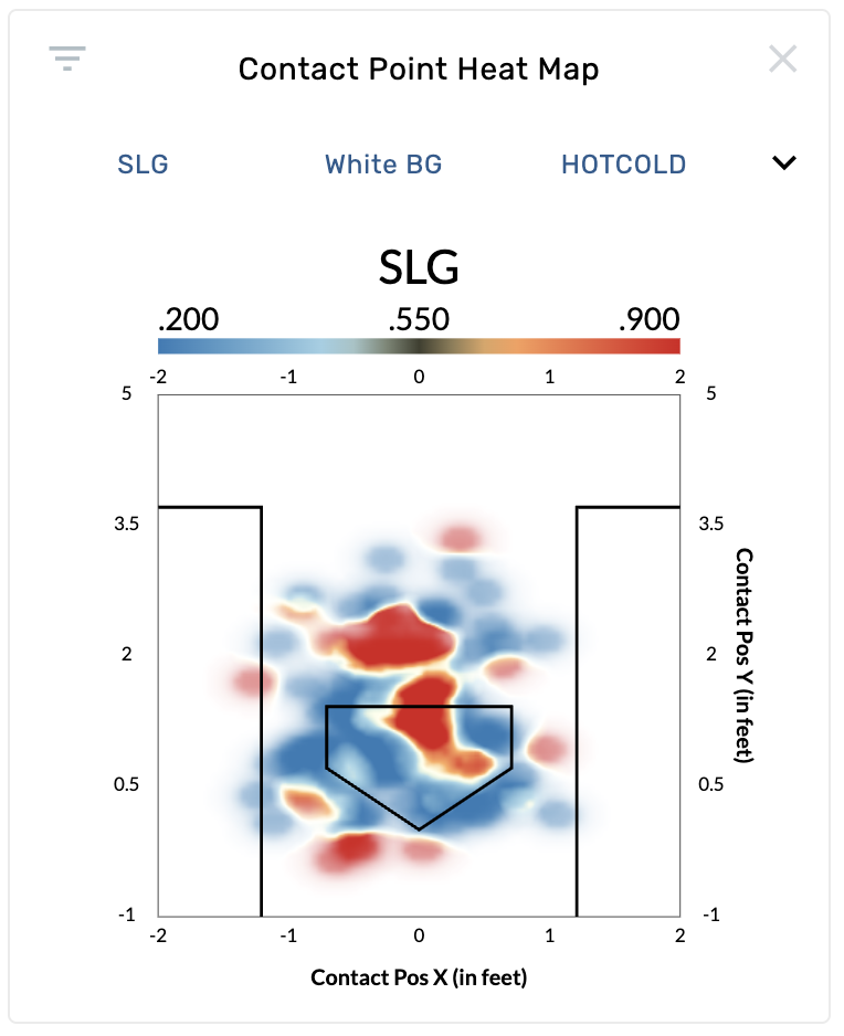
Contact Point Heat Map Chart
- Basic Usage
- Use Cases
- Recent Updates
The Contact Point Heat Map is an aggregated density visualization of where batters make contact with the ball. Unlike the Contact Point Chart (which shows individual dots), this graphic smooths contact data into a continuous heat map, making it easier to spot concentration patterns at a glance. The chart renders the batter's box and home plate for context. This graphic requires pitch tracking data and is available on batting, pitching, catching, and umpire reports.
Settings
| Setting | Options | Description |
|---|---|---|
| Stat | SLG (default for batting), BA, ISO, wOBA, xAVG, xSLG, xISO, xWOBA, Exit Velocity, Launch Angle, Pitch Frequency, Line Drive Rate, Groundball Rate, Flyball Rate, Strike Rate, Swing Rate, Chase Rate, and many more | Controls which metric is displayed in the heat map. Over 75 stat options are available depending on report type and authorization. |
| Background Color | White BG (default), Black BG | Sets the chart background. |
| Spectrum | Rainbow, Cold, Hot, Hot/Cold (default), Sequential | Controls the color gradient used to represent values. |
| Perspective | Top Down (default), Side | "Top Down" shows Contact Position X (horizontal) and Y (depth). "Side" shows Contact Position Y (depth) and Z (height). |
| Normalize Mode | Raw (default), Center of Mass | "Raw" shows contact positions as recorded. "Center of Mass" normalizes each point relative to the batter's position at the plate. Requires Statcast data. |
Reading the Heat Map
- The color gradient legend at the top of the chart shows the range of values for the selected stat (e.g., .200 to .900 for SLG).
- Hot/warm colors indicate higher values, cool colors indicate lower values (varies by spectrum choice).
- Denser areas of contact appear as larger, more saturated regions.
- The batter's box and plate outline help orient where contact is happening relative to the plate.
Find a hitter's power zone
Open a batter's page and select the Contact Point Heat Map. Set Stat to SLG or xSLG with the Hot/Cold spectrum. Red/warm zones show where the hitter produces the most extra-base power. This is a quick way to identify a hitter's sweet spot in 3D space beyond just the strike zone.
Evaluate contact quality from the side view
Switch Perspective to Side with Stat set to Exit Velocity. This reveals whether a hitter generates more power when contact happens at a certain height or depth. High exit velocity zones at different heights can indicate swing plane tendencies.
Compare pitcher effectiveness on a catching report
On a catching report, the default stat is Strike Looking Above Average. This shows where the catcher is gaining or losing called strikes based on contact/pitch location, which is useful for evaluating framing alongside blocking.
Identify batted ball tendencies
Set Stat to Line Drive Rate or Groundball Rate to see how contact location influences batted ball type. Zones with high line drive rates represent the locations where a hitter is most dangerous, while high groundball rate zones may indicate pitches that induce weak contact.
February 26th, 2026
- New graphic: A heat map version of the Contact Point Chart was added, providing an aggregated density view of contact locations colored by a wide range of available stats.