Contact Point Chart
- Basic Usage
- Use Cases
- Recent Updates
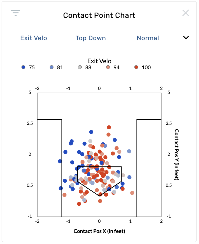
The Contact Point Chart is a scatter plot that shows where the ball makes contact with the bat in 3D space. Each dot represents a single pitch where contact was made, plotted using pitch tracking coordinates. The chart renders the batter's box and home plate for spatial context. This graphic requires pitch tracking data and is available on batting and pitching reports.
Settings
| Setting | Options | Description |
|---|---|---|
| Color By | Exit Velo (default), BIP Result, Batted Ball Type, Launch Angle, Forward Velocity, Foul%, Barrel%, HR%, xAVG, xSLG, xISO, xWOBA, None | Controls the color coding of each contact point. |
| Perspective | Top Down (default), Side | "Top Down" shows a bird's-eye view with Contact Position X (horizontal) and Y (depth). "Side" shows Contact Position Y (depth) and Z (height). |
| Mark Size | Smallest, Smaller, Normal (default), Larger | Controls the size of each dot on the chart. |
| Limit to Last __ Balls | 0–2000 | Filters the data to show only the most recent N contact events. Set to 0 for no limit. |
| Normalize Mode | Raw (default), Center of Mass | "Raw" shows contact positions as recorded. "Center of Mass" normalizes each contact point relative to the batter's position at the plate, removing batter-to-batter stance differences. Requires Statcast data. |
Coordinate System
- Top Down: X-axis is left/right across the plate (-2 to 2 feet), Y-axis is front/back relative to the plate (-1 to 5 feet).
- Side: X-axis is front/back (-1 to 5 feet), Y-axis is height above the ground (0 to 5 feet).
Drag selection is supported — draw a rectangle on the chart to filter to a specific contact location area.
Identify where a hitter makes contact relative to the plate
Open a batter's page and select the Contact Point Chart. Set Color By to Exit Velo. Points colored hot (high exit velocity) show where the hitter generates the most power. Look at whether hard contact happens out front, deep in the zone, or at a consistent depth.
Compare contact depth using the side perspective
Switch Perspective to Side to see contact height and depth. This view reveals whether a hitter tends to make contact high or low, and whether they get on top of the ball or under it. Color by Launch Angle to see how contact height correlates with trajectory.
Normalize across hitters for comparison
Set Normalize Mode to Center of Mass when comparing two hitters on a custom page. This removes stance differences (how close each hitter stands to the plate) so you can compare contact point patterns on equal footing.
Evaluate a pitcher's ability to limit quality contact
On a pitcher's page, set Color By to Barrel% or xWOBA. Look for where opposing hitters are making the highest-quality contact. If high-value points cluster in a specific zone, that identifies a location the pitcher should avoid.
2024 Year in Review
- Normalized Mode control added, allowing Center of Mass filtering. Choose between "Raw" or "Center of Mass" view options. The Center of Mass option normalizes a hitter's position relative to the plate.
August 27th, 2025
- Drag selection added to Contact Point Charts (previously available only on heat charts and heat grids). Draw a rectangle directly on the chart to filter to a specific contact area.